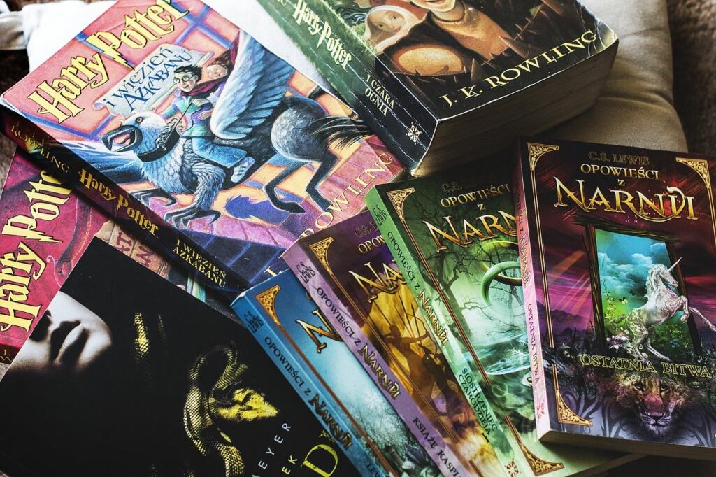
Fantasy book cover design sells when imagery, title and typography signal the right subgenre at a glance and hint at the story without giving it away. Settle the subgenre first, then choose every visual element to match it.
This guide covers cover design as one step in how to get a book published. It runs in project order: what a fantasy book cover must signal, how to brief a cover artist, and how to license what goes on it.
How a fantasy cover signals what is inside
A fantasy book cover works as a fast classification tool. A reader scanning a retail page or a shelf decides in moments whether the book belongs to the kind of story they want. One cover-design guide notes that a well-crafted cover hints at the story and signals the subgenre at a glance. If the signal is wrong, the right readers scroll past and the wrong readers buy and are disappointed.

Three jobs follow from that mechanism:
- Signal the subgenre. Backgrounds, type and palette are the main vocabulary readers use to recognise a subgenre. The next section sets out how they differ.
- Tease, don’t tell. Another guide says images tease the target audience and hint at plot details without revealing too much. A single strong character, object or landscape does this better than a crowded scene that explains the plot.
- Cover the basics on the front. The front cover needs eye-catching imagery, a strong title and typography that conveys the book’s tone. Anything that does not serve one of those three is a candidate for removal.
Stock imagery and commissioned art can both deliver these jobs. What matters is whether the finished picture says the same thing as the book. The next step is working out what that is for your subgenre.
Matching cover style to fantasy subgenre
Subgenre decides the background world a cover should show. The comparison below sets out three common directions. Use it to test a concept against your book before you brief anyone.
| Subgenre | Typical background imagery and mood | Planning use |
|---|---|---|
| High and epic fantasy | Majestic castles, enchanted forests, ancient ruins or sprawling mountain landscapes; fonts, colours and images that hint at heroism and a medieval vibe | Choose when the story centres on a secondary world, a quest or a hero. Let landscape or a heroic figure carry the cover. |
| Dark fantasy | Gothic cathedrals, stormy skies, eerie graveyards, blood-red moons or shadowy figures lurking in mist | Choose when dread and menace drive the book. Keep the image atmospheric rather than explicit. |
| Urban fantasy | Modern cityscapes with neon lights, hidden alleyways or mystical symbols subtly woven into the skyline | Choose when magic sits inside a contemporary setting. Show the city first and the magic as a hidden detail. |
The background imagery comes from a cover-design guide on fantasy backgrounds, and the heroism and medieval cue for high fantasy comes from a second fantasy cover guide.
Do not blend rows to look original. A castle skyline with neon signage tells a browsing reader nothing clear about the book. If your story really does cross subgenres, pick the dominant one for the background and use a smaller cue, such as a symbol or a type choice, for the other.
Working designers organise their portfolios the same way. One designer’s urban fantasy page presents series covers designed to capture the danger, energy and atmosphere of the genre, and lists series branding alongside the covers. Reviewing portfolios by subgenre is the quickest way to find an artist who already speaks your genre’s visual language.
Typography and colour
Typography carries tone before anyone reads the words. One design source observes that serif fonts often evoke classic or historical fantasy, while sans-serifs can suggest modernity or sci-fantasy hybrids. For a quest-driven epic, a serif title is the safer fit. For a modern or hybrid story, a clean sans-serif can mark the difference from older-feeling covers.
Title typefaces that suit fantasy include serif, Gothic, Baskerville or Trajan-inspired faces. Ornate Gothic lettering suits dark fantasy better than a heroic quest. Trajan-style capitals read as formal and monumental, which suits epic titles. Pick a face for the genre feel, then check that the title stays legible in a small retail preview, because text readability is a constraint on both print and digital covers.
Colour does the same job as type. Red, for example, signifies courage, passion or danger. That makes it a strong accent for dark fantasy or a high-stakes series, and a questionable choice for a gentle story. Choose a palette from what the reader should feel, and use one accent colour for the title or focal point rather than several competing ones.
Briefing a cover artist
A good brief turns the subgenre decisions above into instructions a cover artist can act on. The artist then works from your intent rather than guessing. Use these steps in order:
- Name the subgenre and tone in plain words. State the dominant subgenre, then the mood you want the reader to feel.
- Choose one focal element. Pick a character, an object or a landscape, and say which. A single focal point survives small sizes better than a crowded composition.
- List the setting cues you want. Use the vocabulary from the comparison table, such as ruins and mountains, or neon and alleyways.
- Say what the cover must not reveal. Cover images should tease without giving away the plot, so name any spoilers or clichés to avoid.
- Specify the type direction. Say whether the title should feel classic, gothic or modern, and mention any series branding the cover must continue.
- Share reference covers. Pick a few covers from your subgenre and say which element of each you like. The artist can see what you are reacting to.
- Specify deliverables. Ask for print and digital versions, since the two have different technical constraints.

Writing the brief also forces decisions that feed other marketing copy. Settling the tone and stakes now makes the book description easier to write; see How To Write A Book Blurb That Sells: A Practical Guide For 2026 for how the cover and blurb should reinforce each other.
From sketch to final files
Most cover projects pass through the same stages, whether an artist or the author does the work. Start with rough layout sketches that test different focal points. Move to a fuller mockup once you have chosen one. Then refine colour, lighting and type and proofread every word on the cover.
Check the mockup at the smallest size a reader will see it. That is the real test of whether the title and focal element still read. If the image turns to mush, simplify the picture rather than enlarging the type.
Delivery needs care because print and digital covers carry distinct technical constraints: file formats for print versus digital, spine width for physical books, and the need for text readability. Before final export, read the current file requirements on your printer’s or retailer’s own specification page and build to those. Spine width depends on the physical book, so request the final measurement from the print provider rather than estimating it.
Licensing stock imagery, fonts and commissioned art
Cover art can come from three broad routes, and each carries its own licensing question.
- Stock imagery. Licensed stock images are the fastest route and can look professional when the subject matches the subgenre. Read the licence page for the specific image and confirm that commercial use on a book cover for sale is allowed. A licence that covers a blog post may not cover a product.
- Free images and fonts. Some cover resources offer free images and fonts for commercial use. The terms vary by item, so check each licence individually before you build a cover around it.
- Commissioned art. An artist produces something unique to your book. Agree in writing what you may do with the finished art, including print, ebook and promotional use, and whether the artist can reuse elements elsewhere. Keep invoices and licences together in case a retailer or distributor asks for proof.
Fonts need the same checks as images, because the title lettering is part of the cover. Licence every typeface you use, not only the picture.
If the book will have a series look, ask the artist or designer about series branding at the licensing stage. Matching covers across volumes depend on keeping the same fonts and layout rights.
Using the finished cover in your launch
A cover that signals its subgenre clearly is easier to market, because the same image works on retail pages, social posts and printed material. Plan launch materials around it rather than redesigning later; the ideas in Book Launch Party Ideas: 30 Creative Ways To Celebrate Your Release In 2026 can build on the palette and imagery you chose.
Frequently asked questions
Should I hire a designer or make the cover myself?
Both can work. What counts is that the cover appeals to your target audience. Hiring suits authors who cannot yet produce a polished subgenre-appropriate image and type treatment. Doing it yourself suits those who can meet the technical and licensing requirements.
Can I use free images and fonts on a book cover?
Some free images and fonts are offered for commercial use, but terms vary. Read the licence for each item and confirm that selling a book with it on the cover is permitted before you commit to a design.
What must the spine of a printed fantasy book show?
The spine should clearly display the book’s title, author name and publisher logo so the book is easy to identify on a shelf. Its width depends on the physical book, so take the measurement from your print provider.